Creator Mode in My iP gives designated users the flexibility to build dashboards and reports around the questions that matter most to their organization. But the value of a report depends on more than the data it contains. Structure, hierarchy, labeling, and visual design all shape how quickly people understand what they are seeing, especially when reports are used in staff meetings, leadership reviews, athlete conversations, or shared as exported outputs.
Branded reporting is how Creators take that next step. This guide shows how to use styled tiles in My iP to build branded report sections, with examples you can copy, adapt, and reuse.
One principle before the code: branding should enhance a clear report. If the data story is hard to follow, styling will not fix it. Start with the data structure, then apply the design layer on top.
Before you start
Before adding any custom styling, confirm:
- Who the report is for
- What decision or conversation it supports
- Which elements should update when filters change
- Which elements are there only to guide the reader
This shapes every build decision below.
The two layers of a branded report
Every branded report in My iP is built from two kinds of tiles.
Data tiles show the information: charts, tables, single values, and filters that update based on the data.
Design tiles shape the experience around that information: section banners, branded headers, explanatory text, dividers, and layout cues.
Most branded reports use both. The data tiles answer the question. The design tiles make the answer easier to find, read, and share.
Static elements and dynamic elements
This is the most important distinction to understand before you start building.
Static elements are added once and stay fixed regardless of how the report is filtered. A report title, section banner, logo, or explanatory note are all static.
Dynamic elements read from the data and update when the user filters the report. A metric value, chart, table, or athlete name are all dynamic.
Use static elements for branding, navigation, and context. Use dynamic elements for anything that should change when filters change. Getting this right is what separates a report built for one specific review from a reusable template that works across a broader group.
Where custom styling fits
In Creator Mode, the practical way to add custom styled content to static elements is through a Markdown tile. Markdown tiles support basic formatting: headings, links, and images. They also support HTML and inline CSS, which is where the more advanced visual styling shown in the examples below comes from.
That distinction matters. The Markdown tile is the container. HTML and inline CSS are the styling engine inside it. Markdown alone will not produce the section banners, gradient cards, or branded layouts in this guide.
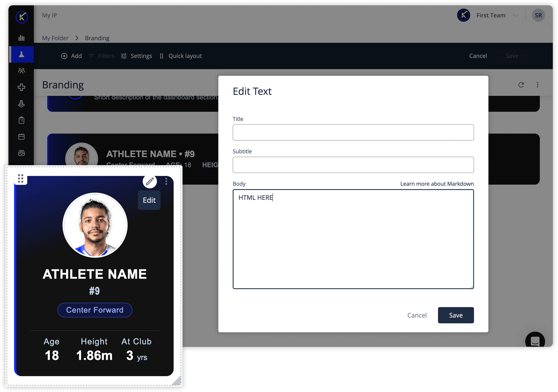
Use styled Markdown tiles for static design elements only: section banners, report introductions, explanatory notes, branded headers, dividers, and fixed profile cards. For anything that needs to update when filters change, use a data tile.
A worked example: Individual Athlete Development Report
The example below shows a branded individual athlete development report built in Creator Mode. The data tiles are standard visualizations: KPI values, competition breakdowns, session summaries, and weekly exposure charts. The design elements around them, the section banners and profile card, are built with styled Markdown tiles using HTML and inline CSS.
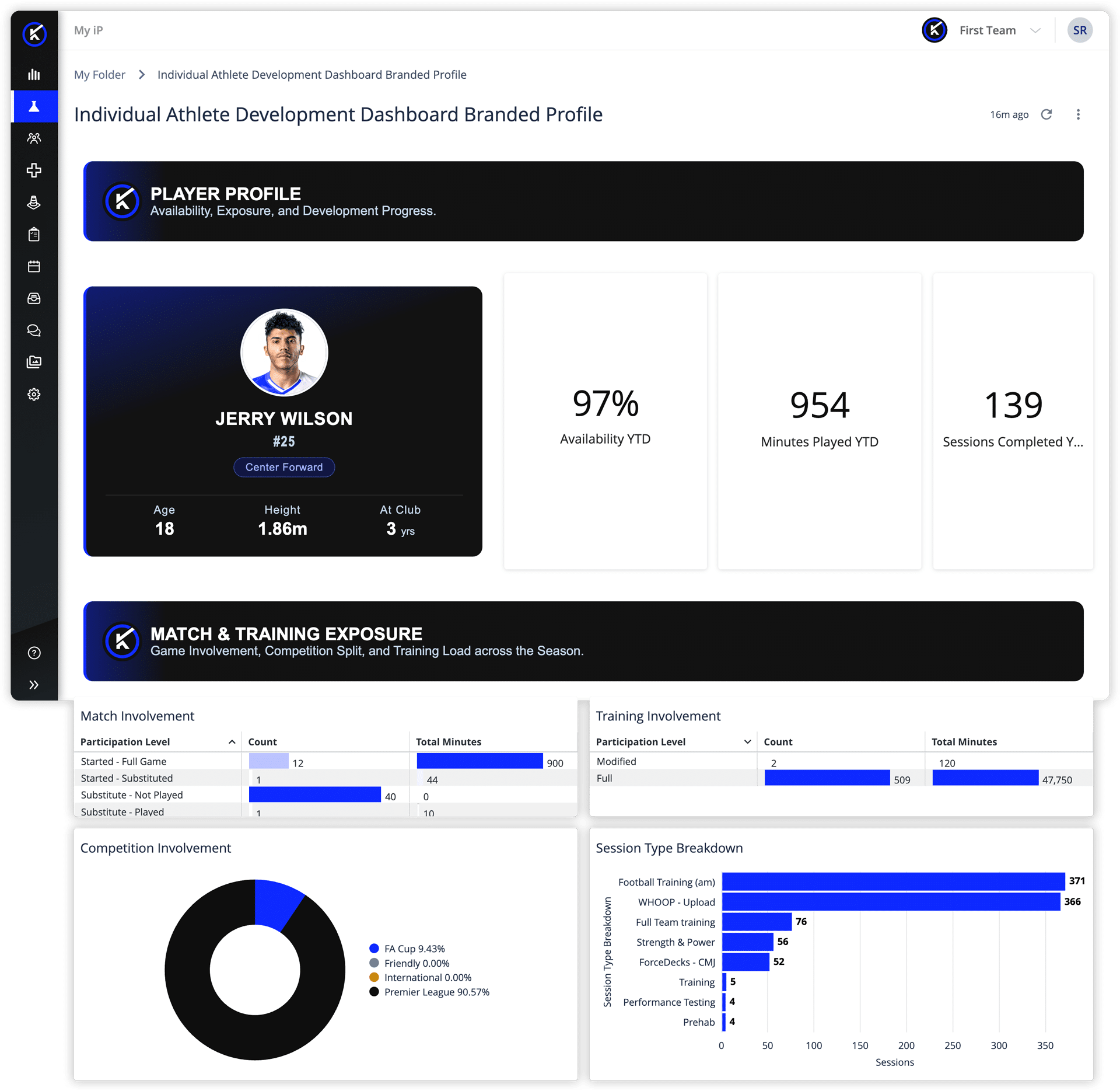
The examples use Kitman Labs brand colors. Replace the hex values with your own brand colors and update the text, labels, and image URLs to match your organization.
Example 1: Section banner
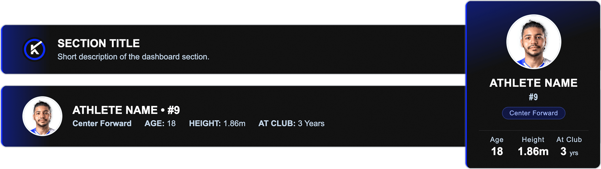
A section banner creates a clear reading path through the report. It introduces a new section, explains what the reader is about to see, and visually separates one part of the report from the next.

Use this when:
- You need a clear section break with a title and short description
- The content does not need to change when filters change
- You want the exported report to remain easy to follow
Do not use this when:
- The title or description needs to update dynamically
- You are trying to display live data
How to adapt it:
- Replace #0f28ff with your primary brand color
- Replace #fe4838 with your accent color
- Keep #121212 as the dark base or swap it for your own
- Point the image URL at a hosted version of your logo
- Update the section number, label, title, and description
To reuse for the next section, copy the full block and change those four text fields. Test in your environment before publishing, as formatting support may vary by tile configuration.
Example 2: Static athlete profile card
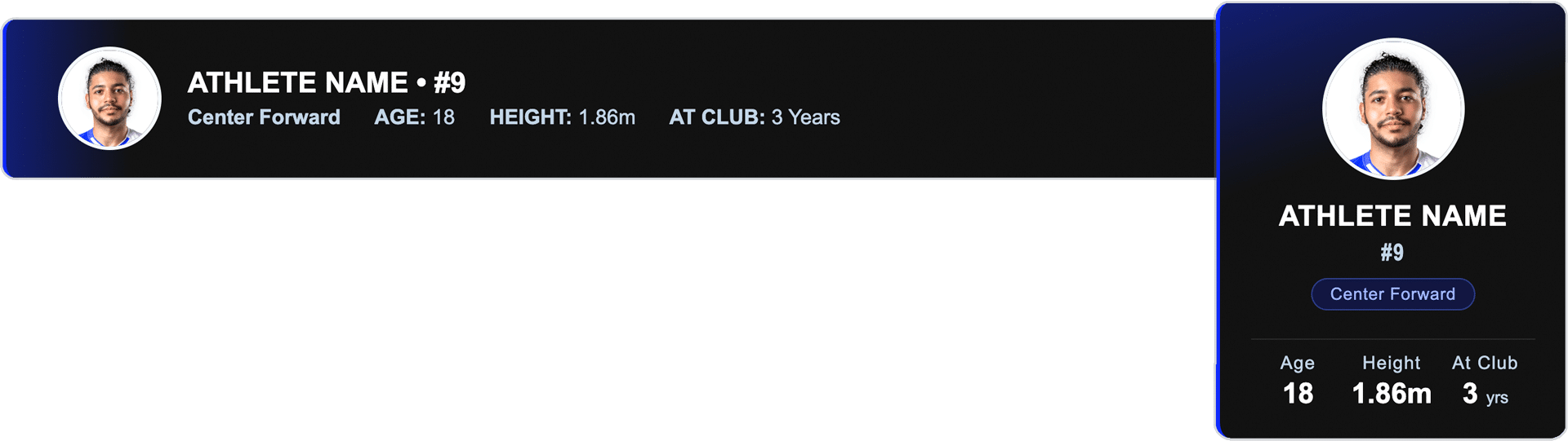
A profile card makes a single-athlete report feel specific and polished. It can include a photo, name, position, squad number, and a row of key attributes.
This tile is always static. The values are hardcoded and will not update when the report is filtered. That makes it best suited to reports built for a specific athlete: a one-off development review, a printed summary, or a presentation. If you are building a reusable template that staff will filter across the whole team, build the athlete’s name and attributes as data tiles so they update with the filter. Use the styled card only for fixed, single-subject reports.
Use this when:
- The report is built for one specific athlete
- The report will be exported, printed, or presented
- The athlete details do not need to change dynamically
Do not use this when:
- The report is a reusable template
- Users will filter across multiple athletes
- The name, photo, position, or attributes need to update automatically
HORIZONTAL VERSION
How to adapt it:
- Replace the photo URL with a hosted athlete image
- Update the name, position, number, and attribute values
- Replace the hex values with your brand colors
Keep the details short so the card remains readable when exported. Use this tile carefully: a static profile that does not match the dynamic data below it will confuse the reader.
Guiding the read
Between the banners and the data, short section labels and consistent spacing create a reading path. A reader who does not live in the data every day should be able to move through the report in a logical order: overview first, then supporting detail, then trends or next steps. The design layer should make that path obvious without requiring the reader to figure it out.
Styling the charts themselves
Styled Markdown tiles frame the report. Chart styling is handled separately, in the visualization editor, when you build or edit the data tile. This is where you manage chart type, series colors, labels, axis names, conditional formatting, and legend settings. Those settings live with the chart and update with the data, so a chart styled once stays consistent every time the report is filtered.
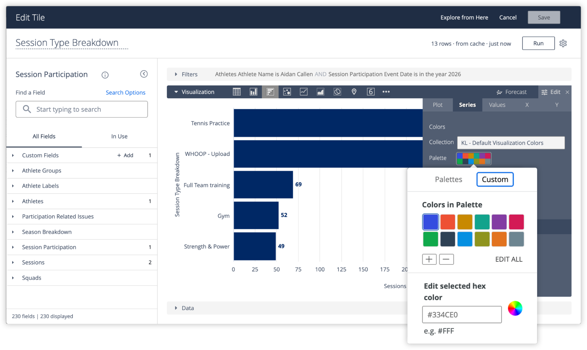
Charts are not styled with markdown or HTML. The design layer organizes and brands the report. The visualization editor styles what is inside the data tiles.
Design for export and sharing
Many reports are downloaded, printed, saved as PDFs, or shared with people who do not log in to the platform. Before finalizing a branded report, check that sections are clearly labeled, timeframes are visible, and the report still tells a clear story outside the live dashboard. If a report is likely to be shared in meetings or printed for review, the design layer becomes especially important: it preserves the structure of the report when the reader is no longer interacting with it live.
Practical guidance
Use brand color for structure, not decoration. Use your primary color in headers and your accent in labels or dividers. Keep dense data views on neutral backgrounds and avoid adding color to charts unless it carries meaning.
Build reusable sections. A consistent header style, label style, and layout pattern makes reports easier to duplicate and maintain. Start from one base structure and adapt it for different workflows rather than rebuilding each time.
Keep custom elements easy to understand. Before adding a heavily styled tile, ask whether it needs to update automatically, whether another Creator will understand how it was built, and whether it still works when exported. The strongest branded reports balance polish with maintainability.
Getting started
Choose one report that staff already use regularly. Define who it is for and what decision it supports. Add one branded section banner, apply your colors consistently, and test it with the people who will actually use it. Once the structure is clear, duplicate it for other workflows.
New to building dashboards in Creator Mode? The Creator Mode walkthrough video at the end of the blog covers the foundations: selecting data, adding dimensions and measures, applying filters, and styling charts in the visualization editor. This guide picks up from there.
Watch the walkthrough: Branding A report as a Creator in My iP
The walkthrough below shows the Individual Athlete Development Report styled from scratch in Creator Mode. You will see how to add a Markdown tile, drop in the banner code, update the colors and text to match your brand, add a profile card, and arrange the layout so the report reads clearly from section to section.