Performance reporting only holds up when the data behind it is complete.
Metrics data is more than a set of numbers. It shapes how performance teams review load, readiness, physical profiling, and trends over time. But data comes from multiple sources, and gaps can surface later in the dashboards and reports the performance team is asked to stand behind:
- A connected source may fail to sync after a game or session
- A variable may stop populating and create gaps in performance reporting
- Incomplete wellness, assessment, or testing data can weaken readiness and profiling views
- An outlier can skew weekly summaries or make a metric harder to trust
- Metric drift can go unnoticed until a report looks wrong
The Metrics Data Health Checks Dashboard in My iP gives performance teams a repeatable way to surface those gaps before they affect reporting.
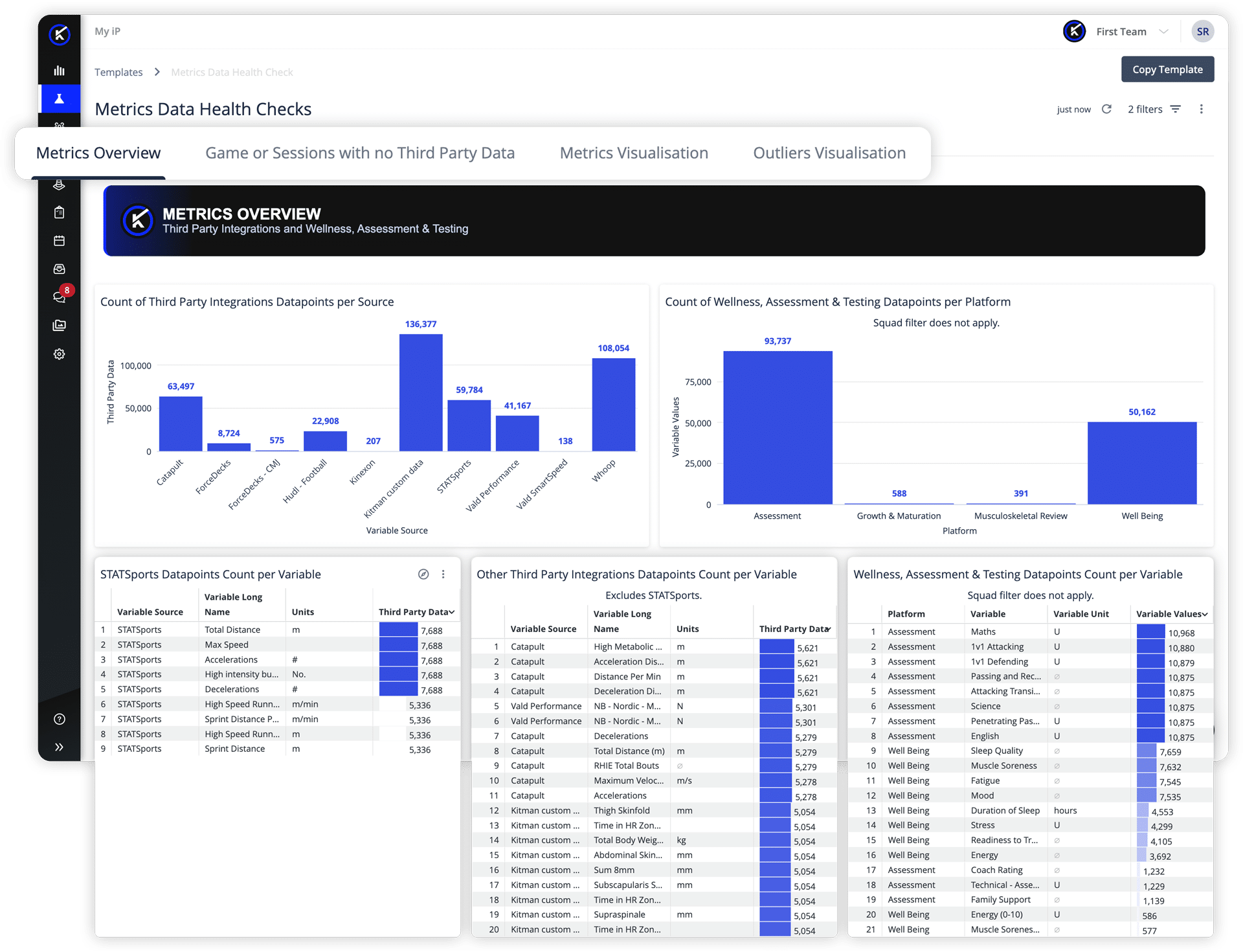
Available as part of the Data Health experience for organizations with the Performance Optimization Solution in iP: Intelligence Platform enabled, it helps performance staff review the integrity of third-party, wellness, assessment, and testing data before it affects load monitoring, readiness reporting, physical profiling, and downstream analysis.
The dashboard can be configured around each organization’s connected sources, selected metrics, reporting needs, and review thresholds.
Why Metrics Data Health Matters
Performance data comes from many places.
GPS systems, force plates, wellness questionnaires, screening tools, assessments, and testing platforms all help teams build a clearer picture of athlete response, readiness, and physical output. But the value of those reports depends on whether the expected data is actually present, complete, and plausible.
Metrics data sits behind questions like:
- Did connected sources sync as expected for the games and sessions in the period?
- Are the right variables populating for the period in review?
- Are games and sessions missing third-party data?
- Are wellness, assessment, and testing data points being captured consistently?
- Do metric values look plausible, or are outliers skewing the view?
- Can load, readiness, and physical-profiling reports be trusted before they are shared?
When metrics data is incomplete or inconsistent, the issue may not surface until later, when a dashboard tile looks empty, a trend appears unusual, or a practitioner questions whether the data reflects what actually happened.
That creates rework when performance teams are already trying to review athlete response, prepare reports, or support planning conversations.
Instead of finding these gaps downstream, teams need a way to check metrics data earlier, on a clear cadence.
A Clearer Way to Check Metrics Data Quality
The Metrics Data Health Checks Dashboard brings key metrics data-quality checks into one view, helping teams see where coverage, variables, or values may need review before reporting depends on them.
It is designed to move teams from ad-hoc spot-checks, the “did the units sync for last weekend’s game?” question asked one source at a time, to a repeatable data-quality workflow for performance reporting.

The dashboard helps teams review:
- Third-party integration data points by source
- Wellness, assessment, and testing data points by platform
- Data point counts by variable
- Games and sessions with no third-party data attached
- Metric trends, distributions, and summary statistics
- Outliers across game and training data
The goal is not just to find missing data. It is to give teams a clearer starting point for reviewing the inputs behind load monitoring, readiness reporting, physical profiling, and performance analysis.
What the Dashboard Helps Teams Review
The dashboard gives teams a configurable view of common metrics data-quality checks. Designated users can adapt it over time to reflect the organization’s connected sources, selected metrics, reporting needs, and review thresholds.
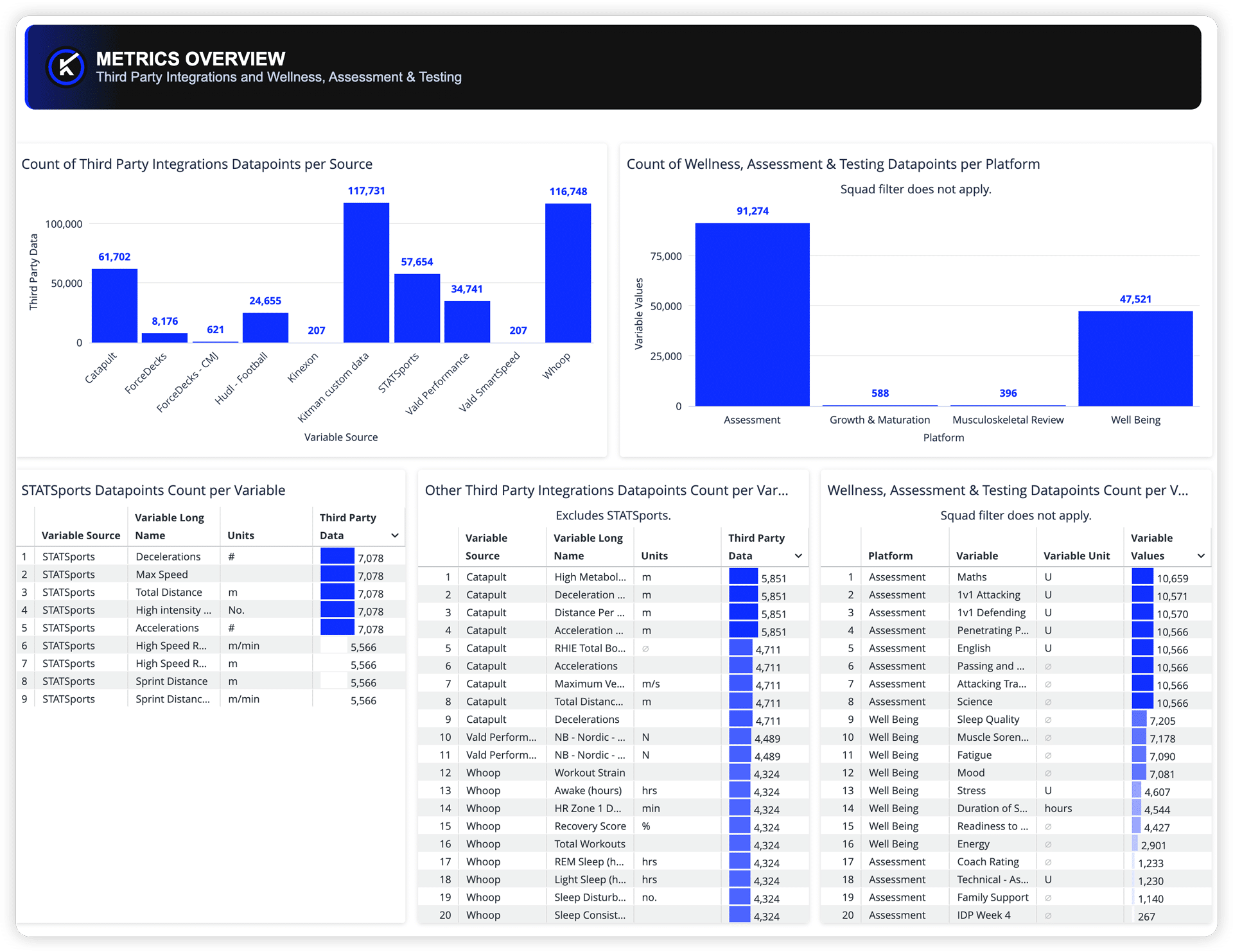
METRICS OVERVIEW
The dashboard gives teams a top-line view of data volume by source, platform, and variable.
This helps performance staff quickly see whether connected sources are producing the expected amount of data, whether wellness, assessment, and testing inputs are being captured, and whether specific variables may be under-reporting compared to others.
METRICS VISUALIZATION
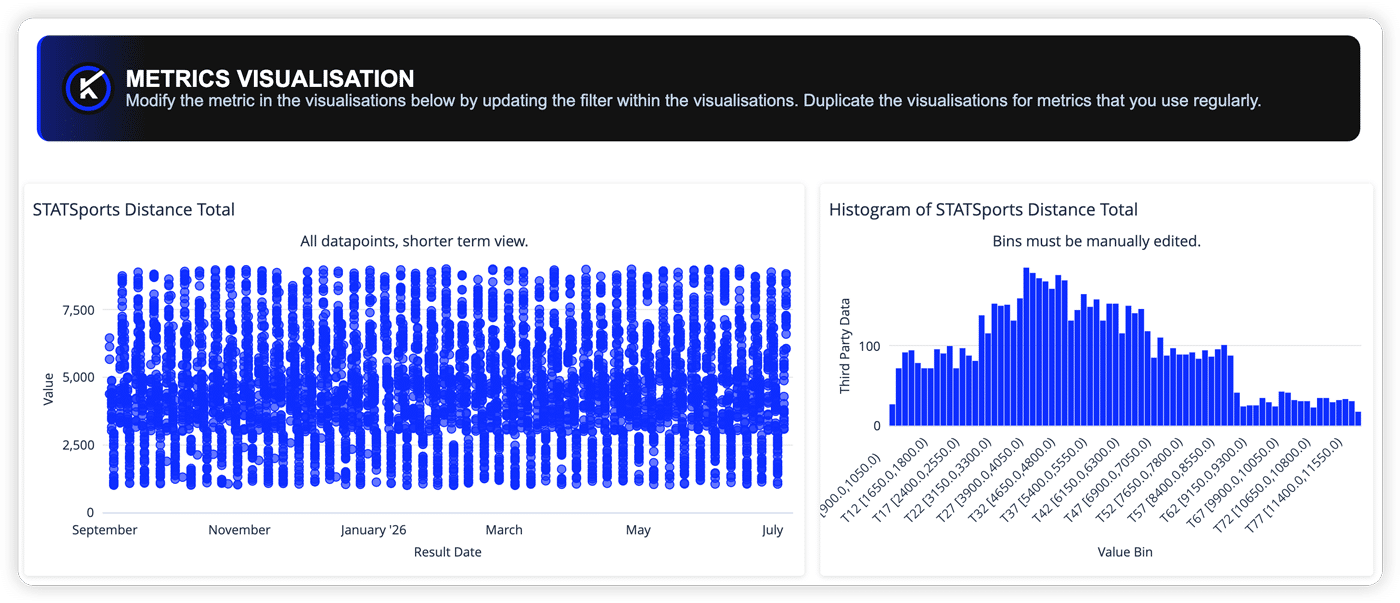
The dashboard includes a configurable view for monitoring selected metrics over time.
Teams can review recent data points, distribution patterns, summary statistics, and monthly changes to spot dropouts, shifts, or drift in the metrics they rely on most.
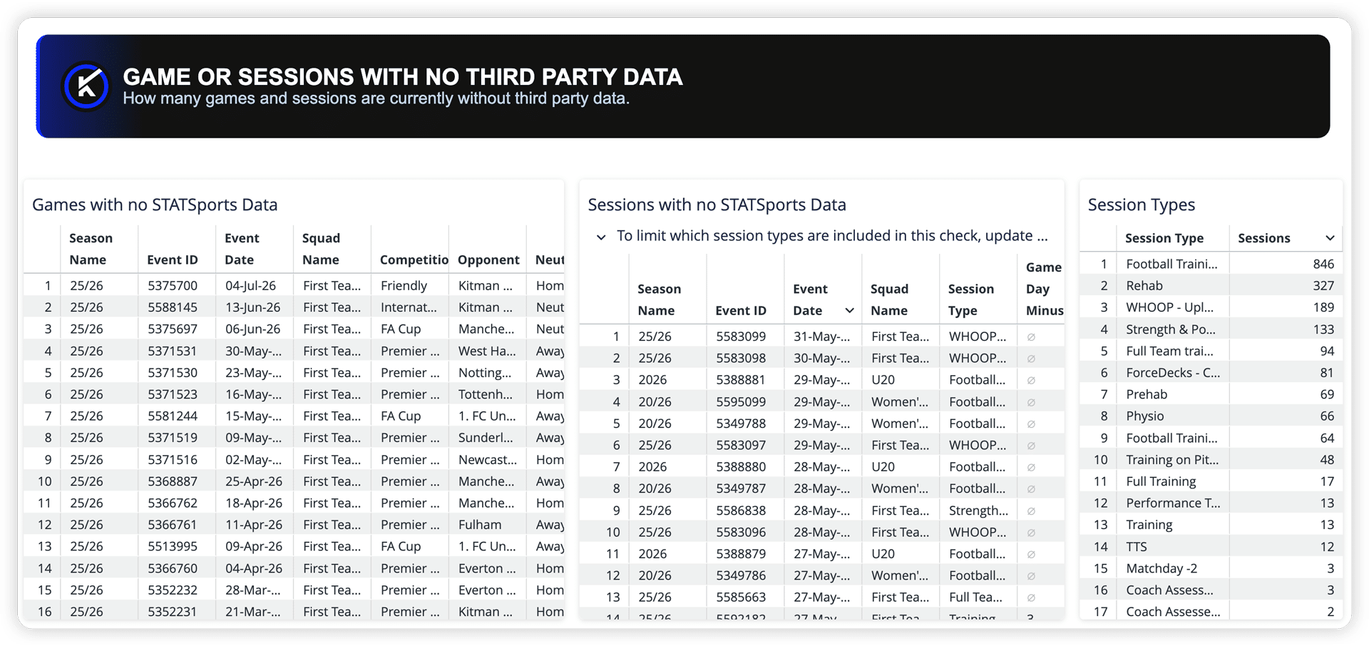
GAMES OR SESSIONS WITH NO THIRD-PARTY DATA
The dashboard helps teams identify games and sessions where expected third-party data is missing entirely.
This gives teams a focused way to review coverage gaps before they affect workload analysis, exposure review, session reporting, or downstream dashboards.
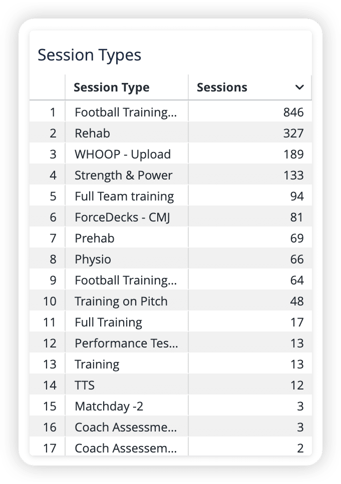
SESSION TYPES
Session type counts help teams check whether the right session categories are being included in coverage expectations.
This can help teams review whether specific session types should be included in third-party data checks, or whether certain categories should be treated as expected exceptions.
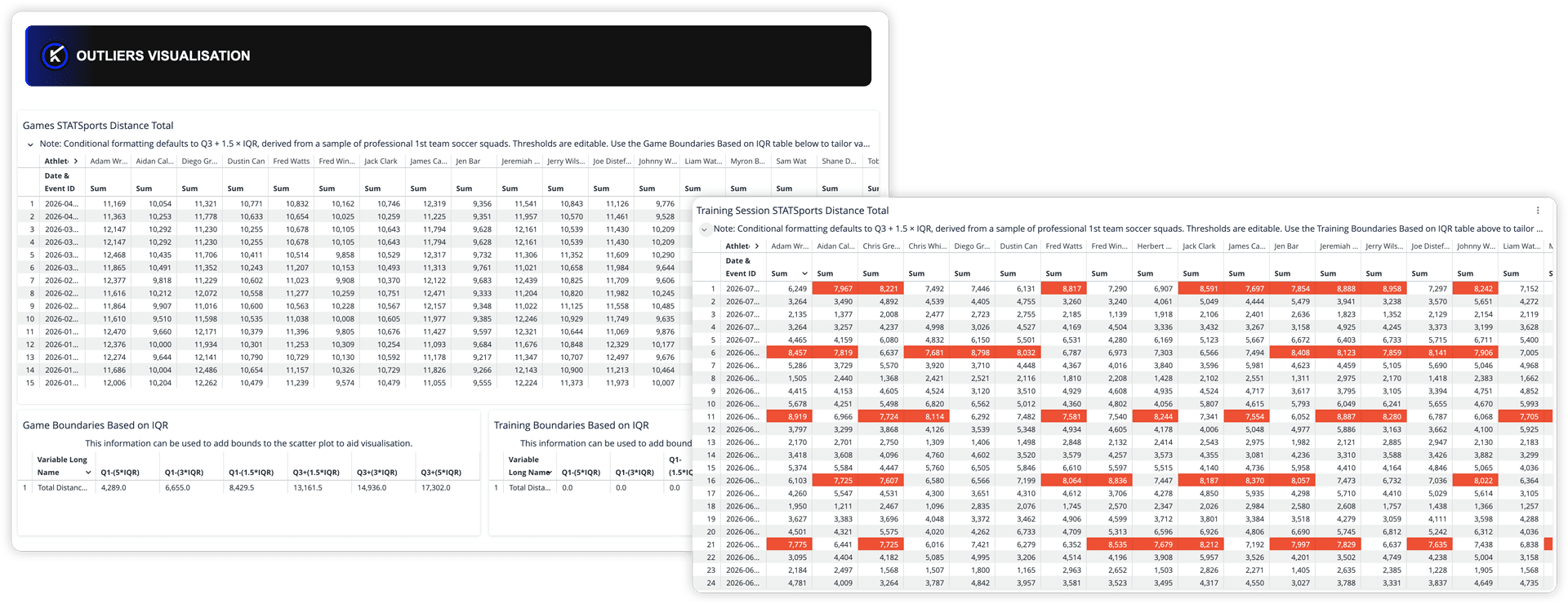
OUTLIERS VISUALIZATION
The dashboard helps teams identify implausible or unusual values across game and training data.
By surfacing values outside expected ranges, teams can review whether an outlier reflects a real event, a device issue, a mapping problem, or a data-quality issue that needs correction before it skews reporting.
When Teams Should Use Metrics Data Health Checks
This dashboard works best when performance teams run it on a regular cadence, with a clear owner for the review that follows.
That cadence might include:
- Before weekly performance reporting
- After a game or training block
- Before load, readiness, or physical-profiling reports are shared
- Before dashboard rollout or stakeholder reporting
- During onboarding or integration setup
- When dashboard tiles look empty or incomplete
- When metric trends, values, or distributions look unusual
- When wellness, assessment, or testing coverage needs review
Run consistently, the dashboard helps teams catch metrics data issues earlier, reduce manual spot-checking, and protect confidence in the reporting that depends on connected performance data.
Who Benefits from Metrics Data Health Checks?
Performance Data Managers and Admins
For performance data managers and admins, the dashboard provides a clearer way to monitor data coverage across connected sources and key variables.
Instead of manually checking whether an integration synced or whether a source populated correctly, teams can review common metrics data-quality issues in one place and prioritize what needs attention.
Sports Scientists and Performance Analysts
For sports scientists and performance analysts, metrics data quality shapes how confidently they can interpret load, readiness, physical outputs, and trends over time.
Knowing where data may be missing, incomplete, or unusual helps reduce rework and supports cleaner performance analysis.
Heads of Performance
For Heads of Performance, reliable metrics data supports confidence in the reports used to guide planning, review athlete response, and align staff around training decisions.
The dashboard helps ensure load, readiness, and physical-profiling outputs are built on data that has been checked for coverage, completeness, and plausibility.
Strength & Conditioning Staff
For Strength & Conditioning staff, variable-level coverage matters.
The dashboard helps teams confirm whether the specific metrics they rely on, such as total distance, max velocity, force-plate metrics, or testing outputs, are populating as expected for the athletes and periods they care about.
Heads of Medical
For Heads of Medical, wellness and screening data only supports athlete review if it is being captured consistently.
The dashboard helps surface when wellness, MSK, or screening compliance is dropping before the gap is discovered during a review that depends on it.
Supporting Better Data Review, Not Automatic Decisions
The Metrics Data Health Checks Dashboard helps surface data that may need attention, but it does not decide what should happen next.
A missing session may reflect a sync issue, a session category that needs to be reviewed against coverage expectations, or a source that was not meant to collect data for that event. An outlier may reflect a device issue, a mapping problem, or a real athlete output. A drop in wellness data points may indicate compliance issues, survey configuration changes, or expected variation in usage.
The dashboard gives teams a shared starting point for review. What to correct, investigate, personalize, or leave as-is stays with the staff who know the workflow and data best.
Cleaner Metrics Data, Stronger Performance Reporting
The Metrics Data Health Checks Dashboard in My iP helps teams strengthen the data behind key Performance Optimization workflows, including load monitoring, readiness reporting, physical profiling, and downstream analysis.
By surfacing missing source data, under-reporting variables, coverage gaps, metric drift, and outliers in one repeatable view, teams can spend less time hunting for problems and more time improving the quality of the data their reporting depends on.
Cleaner metrics data makes performance reporting easier to trust.
And when the reporting is easier to trust, teams can move faster from data review to clearer performance insight.
Contact us to explore how the Data Health experience can help your organization strengthen the data behind its reporting.